
I mentioned in part 1 that it's important to take some time before the meet to make guiding decisions about the general shape of the coverage. As a documentary photographer, I always feel a sense of duality between my aesthetic decisions and my storytelling decisions — they're almost inseparably intertwined. And as much as I love to make beautiful images, my actual aspiration is to make images whose aesthetics support the meaning that they're trying to convey. For track and field, beauty is often, but not always, the tool of choice.
Ground Rules

My goal for this post is to discuss some of the aesthetic decisions that I made, or alternatives that I tried, while covering this year's Stanford Invite. But I also want to link those aesthetic decisions and experiments with the semantic decisions and experiments that they correspond with.
To be clear, this isn't to say that all of my decisions are principled or planned in advance — there are definitely plenty of times when I try something on a whim, with no idea how it'll turn out. But whenever I contemplate a semantic decision, I also consider the aesthetics of it. Whenever I contemplate an aesthetic decision, I also consider the semantics of it.
It's also good to note the alternatives that I don't plan to consider. For me, one of the most essential traits of track and field is movement. Stillness, when it occurs, is the exception rather than the rule. So when I tell the story of track and field, I want movement to be the default sensation that a person sees in my pictures. I want my depictions of stillness to feel unexpected and inherently meaningful.
So a result is that nearly all of my track and field photos show motion blur. They're not blurry — I try to keep the main focal elements sharp — but I don't set the shutter speed so fast as to stop and obscure the motion of hands and feet and implements and backdrop. Tack-sharp-everything is certainly a valid way to photograph athletics. It's just not a direction that I have any interest in exploring.
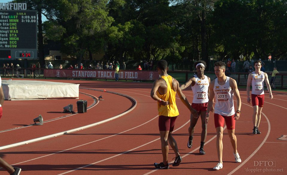
Wide versus Tight
One pair of aesthetic decisions that I reconsider constantly are focal length and distance-to-subject. Those factors create the field of view, which is the foundation for the composition of the shot. The decision of whether to shoot something wide, or medium, or tight couples with two related semantic decisions: Do I want to tell a story about a group or an individual? And do I want to tell a story with more context, or one with more focus?

The wide shot offers a greater sense of place and situation — it's not just at Stanford, but it's in front of a pretty large, dense crowd, on a day with a clear blue sky, and the central athlete is leading the race. The image doesn't just show the race; it shows you what it would have been like to sit in those stands and watch. The negative space at the left and bottom of the frame gives the sense that he is leaving everything and everyone else behind.

The medium shot focuses more on the specific moment of the race, and doesn't give as much of a sense of being there. You can still see the spectators in the background, but you lose the sense of what it would be like to be seated in the stands. There's more focus on hurdling, but there's also less atmosphere.

Finally, the tight shot goes even further in that direction. How many other competitors are there in the competition? Hard to tell. Is this person in the lead? Who knows? The photo brings us into the competitive moment between these two athletes, but we lose track of a lot of the context that was clearer in the other photos. As the view has tightened, we've likewise narrowed our story from an overview to a vignette.
High versus Low
Height is always relative. Looking up or down at a person always carries at least a slight social implication about where the viewer stands relative to that person. A subject seen from below can seem inaccessible. Seen from above, they might feel like part of the masses. And seen on the level, as someone who is, in some respects, very similar to the viewer.

When you look up at a pole vaulter in flight, they seem untouchable. For me, that fact that the trees, clouds, and stadium lights are the only real points of comparison feels like it emphasizes just how high they're going. In the same way that you can't even imagine being tall enough to touch the top of a tree, or a cloud, it feels like they're so far up there, and the rest of us are down here.

Looking straight ahead at someone makes it easier to compare them against the people around them. For high jump, that can help to emphasize the extent of that physical feat — it's easy to see that we all started on the same ground, but then they seem to levitate in a way that's not possible for most of the rest of us.
So when you look up to see someone, it can feel like they're incomparable. But seeing them around other people provides a basis for comparison that can help to tell the story of their specific talents.

When you look down at someone, it conceals the height differences between them and the people around them — a high-jumper seen from above will seem more like they're at the same level as people standing on the ground. For some events, though, that helps to emphasize other aspects of their performance.
In the open sprints, diminishing height makes it easier to see the other spatial dimensions more clearly. Shooting this image from above helps to make the runners visible as individuals. If I were able to shoot this same image from ground level, the group would seem a lot more like one leader and the rest of the pack. But from above, it's very clearly 9 distinct runners.
Lightness, Darkness, and Contrast
Lightness, darkness, and contrast are, in many ways, the building blocks of photography. Stylistically, I love incorporating details into my shots that are small, but pivotal to the meaning of the image. I often try to use contrast to emphasize those details in a way that makes them easier to notice in spite of their small size.

It's easy to forget, on a bright, cloudless day, that the sun itself is still dramatically brighter than anything else in the scene. I tried to use that here to draw attention to one particular silhouette among a scene filled with various high-contrast elements. The starter's pistol is ubiquitous in the running events, and I wanted to make an image that emphasized that particular relationship.

I used the light here to emphasize the texture of the athlete's hair. It not only singles her out among all of the other elements in the scene, but I feel like having her face in shadow makes this image feel somewhat contemplative and serene, in a way that seems fit for a block start: it takes a balance of relaxation and focus to react quickly to the pistol without being so twitchy as to tempt a false start.

This is a near miss that I still wanted to share, since it's something I've been working on pretty consciously during this year's meets. As the sun sets around Stanford's track, it shines through the tall surrounding trees in a way that creates dappled highlights in certain areas.
After seeing the lead-off runner pass through this section, I pre-focused exactly where I wanted the shot to happen, and waited for the first handoff (which is in lanes, for the 4x400m). As the runner in lane four entered the light, I fired off this shot. Sadly, I didn't plan on the outside runner crossing through a different patch of light at the exact same time, but it's one more example of how light can isolate and emphasize the important details in a scene.

Finally, I used the interplay of light and shadow in an attempt to capture the feeling of a night race in this shot. I had previously noticed that in this particular area, the near (right) sides of the athletes are in shadow, while their fronts and rears are highlighted with shallow-angle illumination from the stadium lights. Combined with the inclusion of the stadium light tower in the backdrop, this becomes an image where the lighting is really interesting, but also makes intuitive visual sense — the runners are highlighted in that particular way because there is no sunlight.
Truth and Beauty
What is the beauty of track and field? And what is there to track and field that isn't beautiful? I feel like there has to be a mixture of both aspects, and my goal is to show what is there, regardless of where in that spectrum it might fall.
And in capturing and telling those stories, I always hope to combine aesthetics and semantics to share something that feels — that is — sincere. A story that will make people think "wow, that is track and field," even if it might not always make them think "wow, that is beautiful." These last two posts have been a peek behind the scenes at how I strive to meet that aspiration.
Finally, I need your help. Do you enjoy these kinds of articles? What else would you like to hear about? Do you prefer posts that are on the longer or shorter side? Leave me comments below, or contact me any other way. I invest dozens of hours into nearly every post that I publish, and I want to make sure I apply those hours in the right ways, and to the right topics. So first and foremost, if there's something I can do to create and share things that you'd enjoy or appreciate more, please let me know. I want your feedback.
Second, I want to share work that earns your support. The only money that goes to support my photography is what comes out of it. This is by design — photography is only sustainable for me if I can connect with people who appreciate my work. So if you like this kind of article (or anything of the other work I've done) and want to encourage me to make more, please consider supporting me on Patreon. I also love to make and sell prints. Thanks for reading, and I hope to see you in the future 👍.