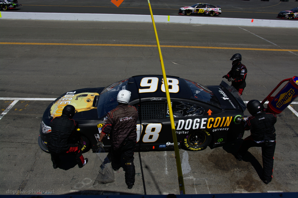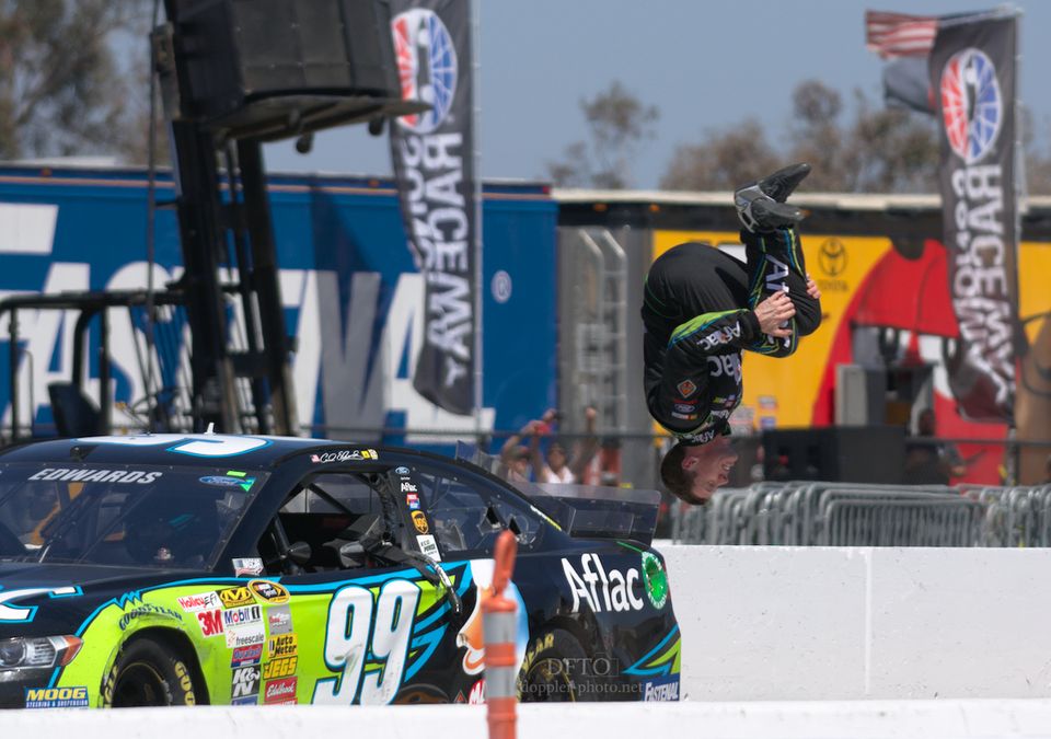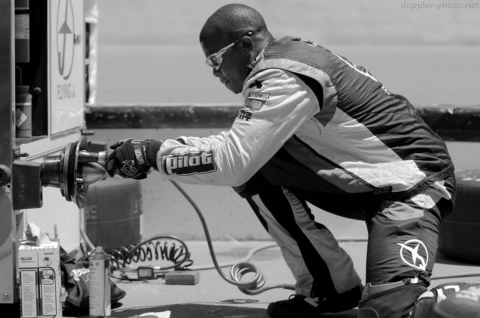
For day three, I decided to dig into my mostly-neglected set of images from the NASCAR Toyota/Save Mart 350, held at Sonoma Raceway back in June of this year. As far as conversions go, this time was all about controlling the viewer's visual attention — getting them to notice certain things, and to pay less or no attention to other things. Many of the the NASCAR teams feature incredibly bright, saturated colors which are designed to attract attention, and the grayscale conversion allowed me to work against that dynamic.
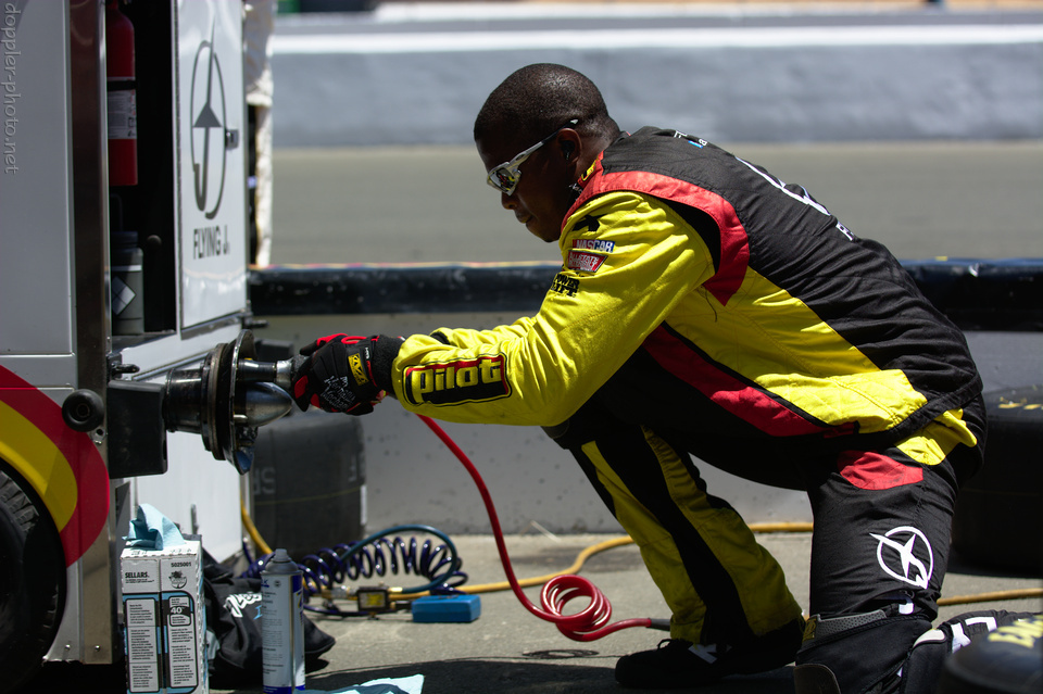
My treatment of this first image was mainly to diffuse the viewer's attention. In the original, the bright colors draw your attention to the crew member's uniform, and from there, to his face, to his hands, to the air hose on his gun, and to the fire extinguisher inside. As your eyes take in the image, it ends up being difficult for them to focus on other aspects of the scene — the tires and other pit-stop paraphernalia surrounding the main subject; the details of the mock hub mounted to the trailer; even the actual expression of concentration on his face that reinforces the dynamic pose of his body.
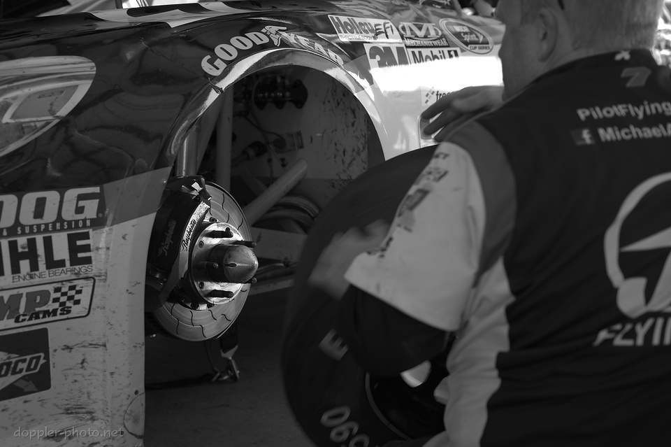
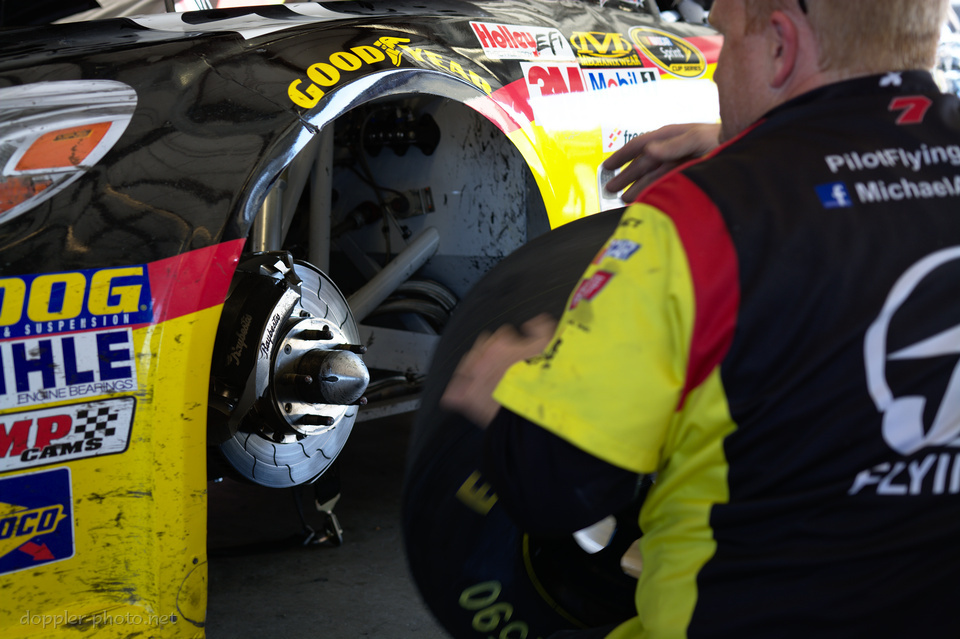
By contrast, the treatment of the second image was to make the distribution of viewer attention more focused. The bright colors everywhere cause the viewer's eye to bounce around the scene. Whereas in the monochrome version, all of the colors are relatively similar shades of gray, and the strong contrast of the brake components draws the viewer's eye into the wheel well.
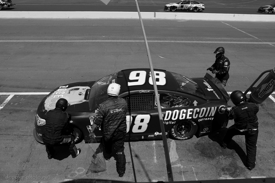
This one didn't really work out; but not all experiments turn out how you hope they will. I wanted to focus attention on the different crew-member acts — hands poised to give the car a push start out of the pits; gas can chugging away; new windshield tearoff whipping in the wind; and something with the front-left wheel.
But it's all pretty muddled. The windshield tearoff pretty much disappears when I try to set the curves/contrast for the rest of the scene, and if I set things for the tearoff, the rest of the scene ends up with way too much contrast. The comromise that I'm publishing is really just the worst of both worlds. Oh well. Still more to learn :o)
